BM Lithe Upright
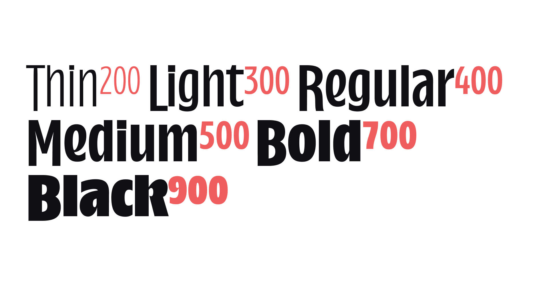
The Upright styles span a wide range of weights, from Thin to Black. This choice of weights will allow you to create everything from elegant, slender to loud and confident designs.
The Upright styles span a wide range of weights, from Thin to Black. This choice of weights will allow you to create everything from elegant, slender to loud and confident designs.
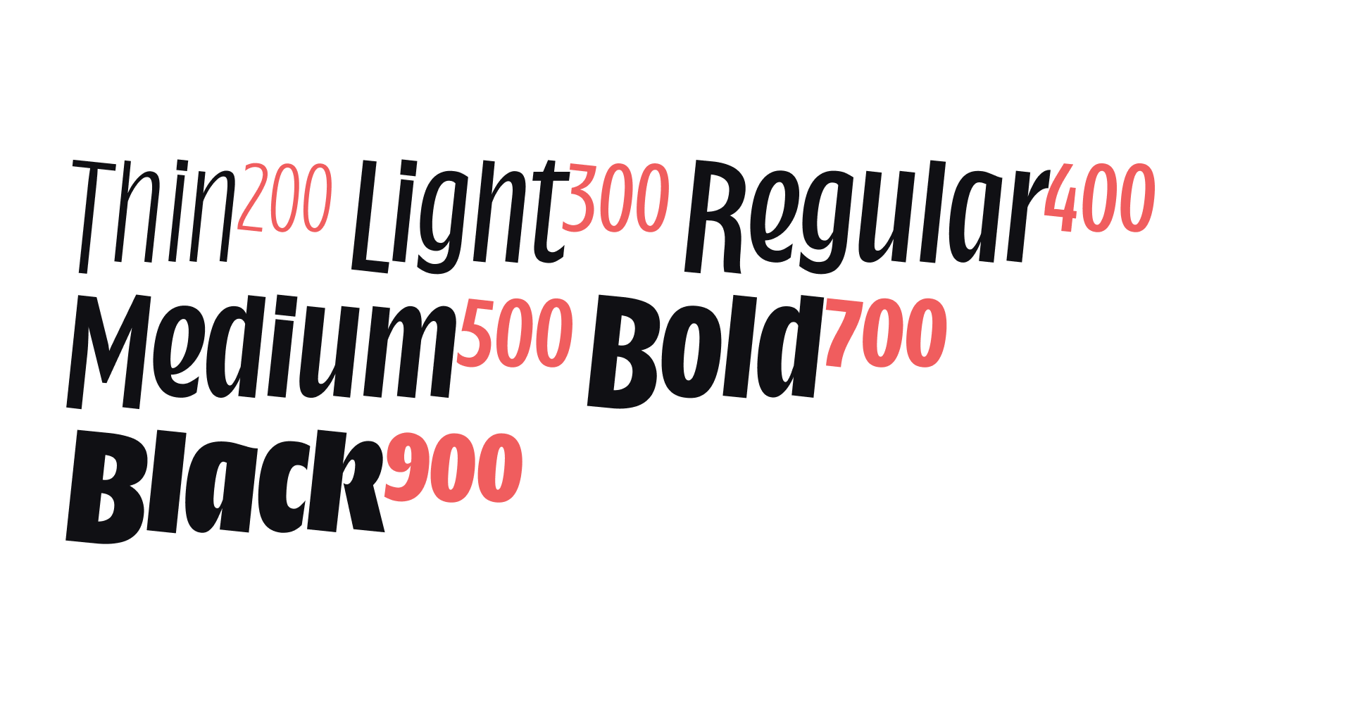
The Italics are spread accross the same span of weights, harmonising with the upright for each weight value. The Italics can be used to complement the upright styles, but are also great on their own to make your designs even more dynamic.
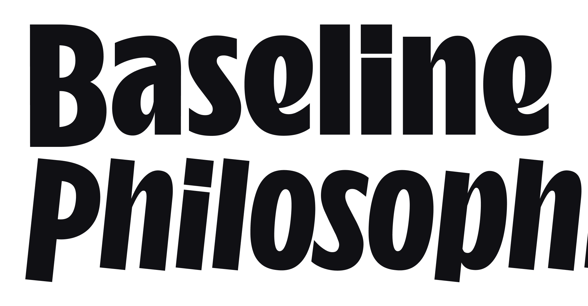
Next to the very dynamic curves of BM Lithe, it is the unusual treatment of the capital letters that give this typeface its distinct flavour. Instead of sitting on the baseline, like most typefaces, BM Lithe floats around the optical vertical center of the words.
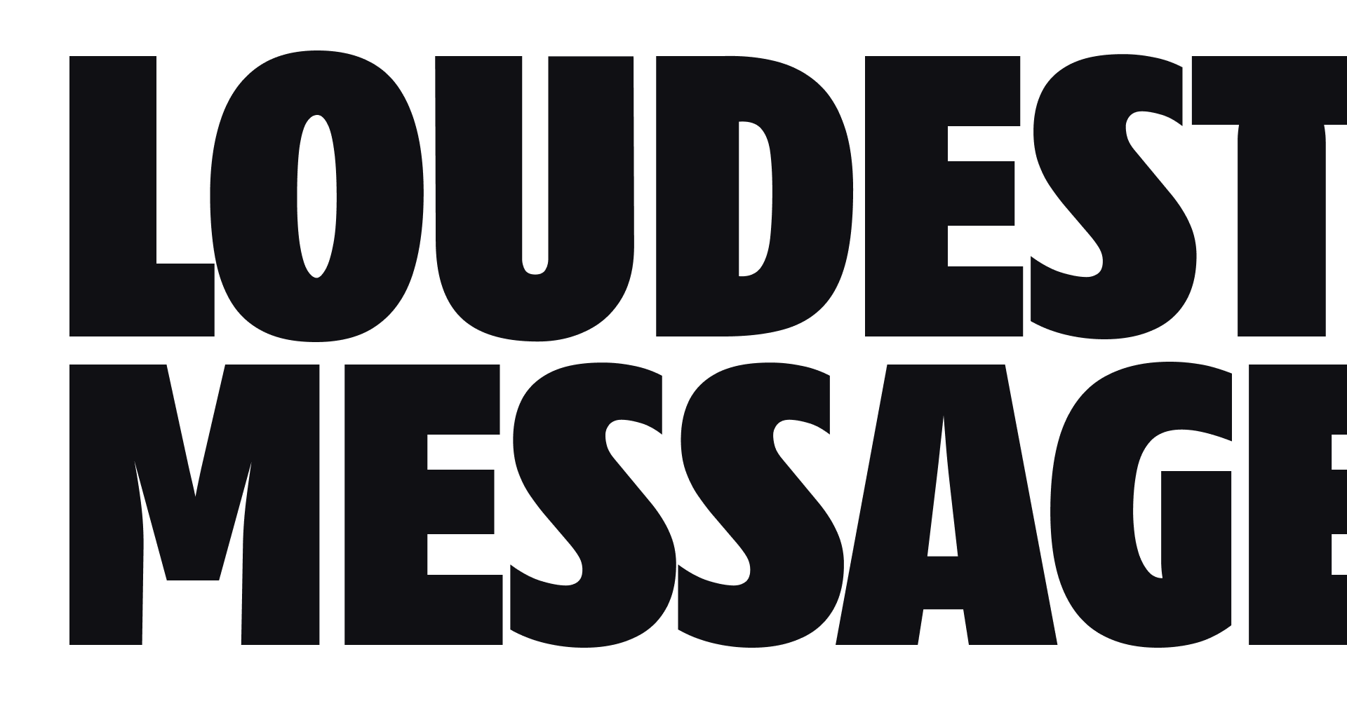
Use BM Lithe to create loud and clear designs. It's ideal for headlines and slogans, so simple and large applications of the typeface is what we recommend. It comes even more to life with vivid colours.
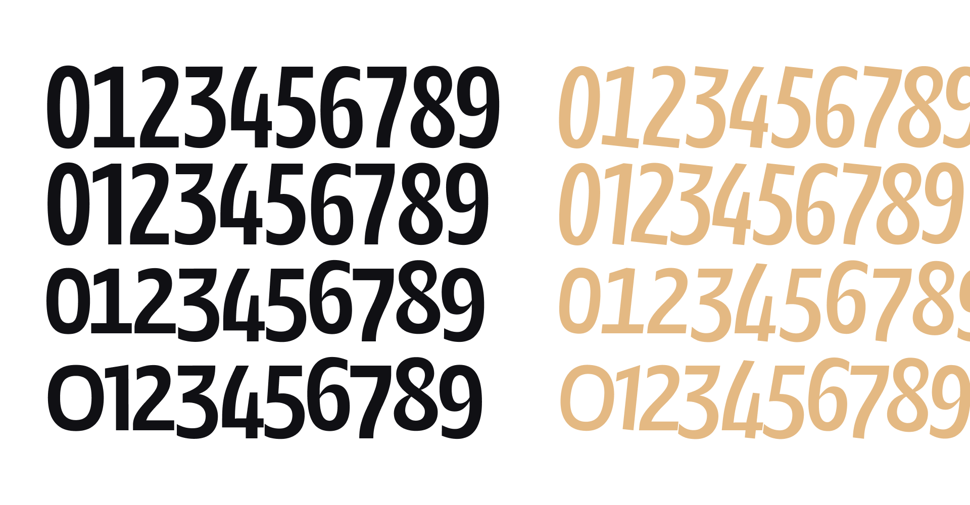
Because of the strong difference between capitals and lowercase letters, we've included four sets of different figure styles. Use Lining Figures with capitals, and Old Style Figures with the lowercase letters. And if this font ever ends up in a table, tabular figures will accomodate that usage too!

Activate the CASE feature to make sure your period, comma or underscore line up nicely with the base of the capital letters.
.class{font-feature-settings: "case" 1;}

Activate the SS01 feature to swap the a for an alternate shape in both Upright and Italics.
.class{font-feature-settings: "ss01" 1;}
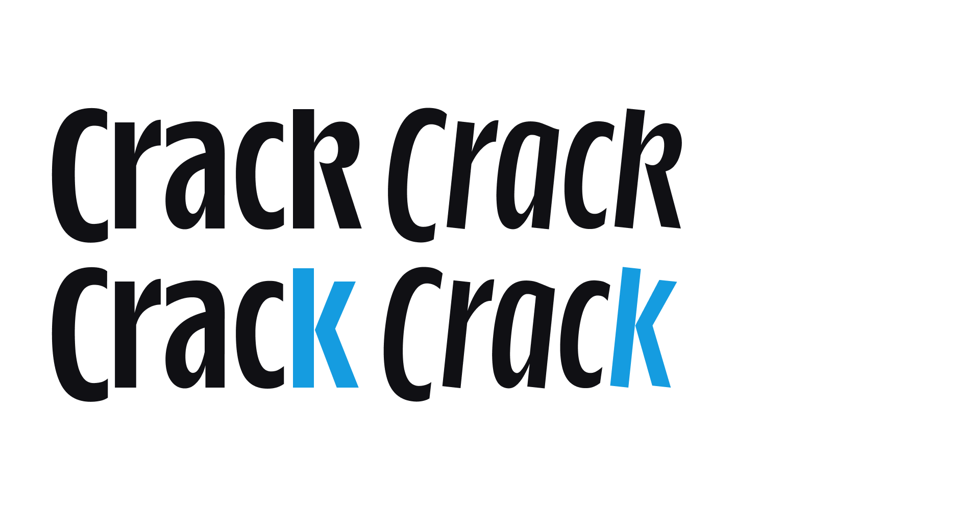
Activate the SS02 feature to swap the k for an alternate shape in both Upright and Italics.
.class{font-feature-settings: "ss02" 1;}
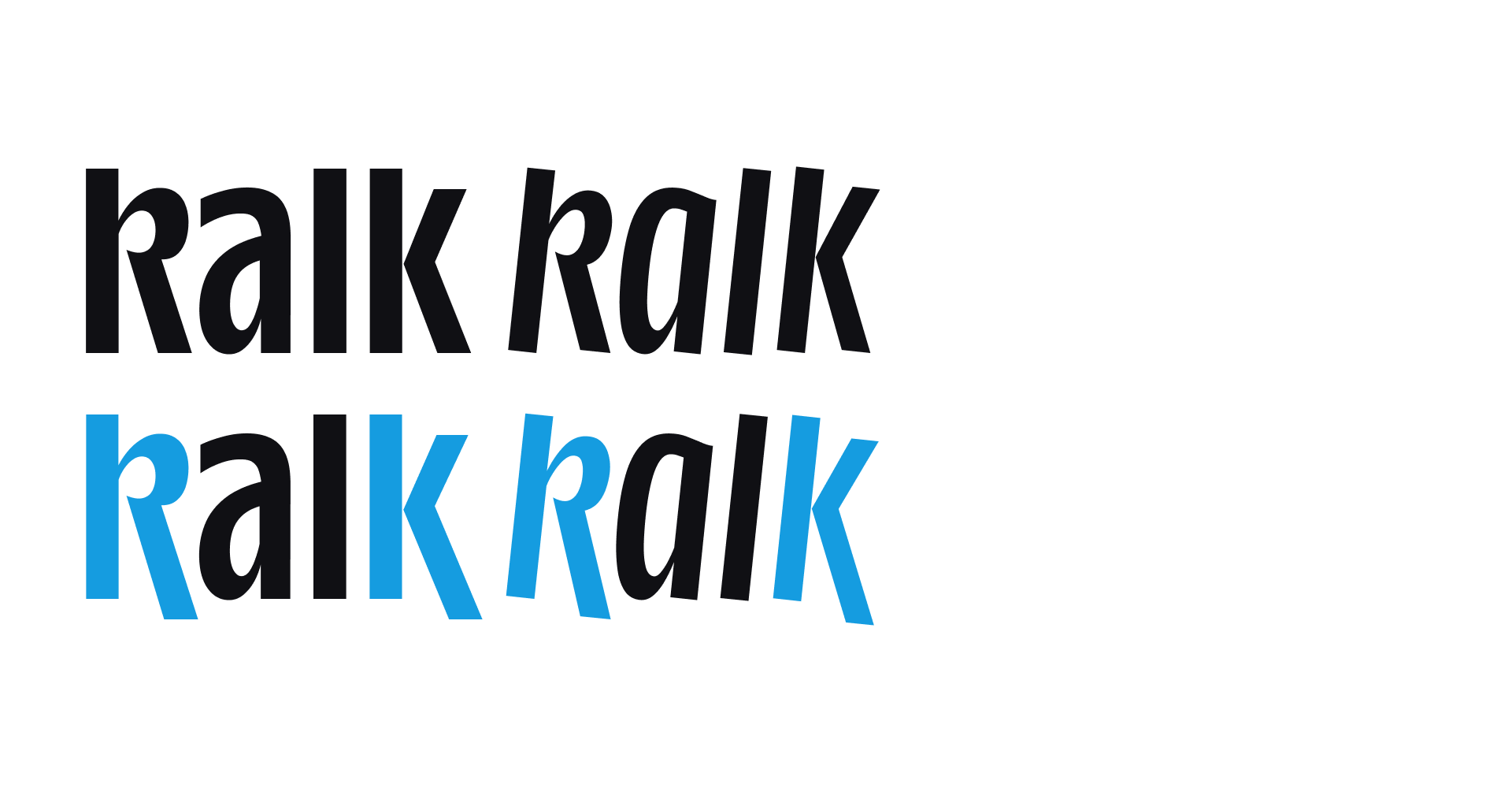
Activate the SS03 feature to swap the k for an alternate shape in both Upright and Italics.
.class{font-feature-settings: "ss03" 1;}

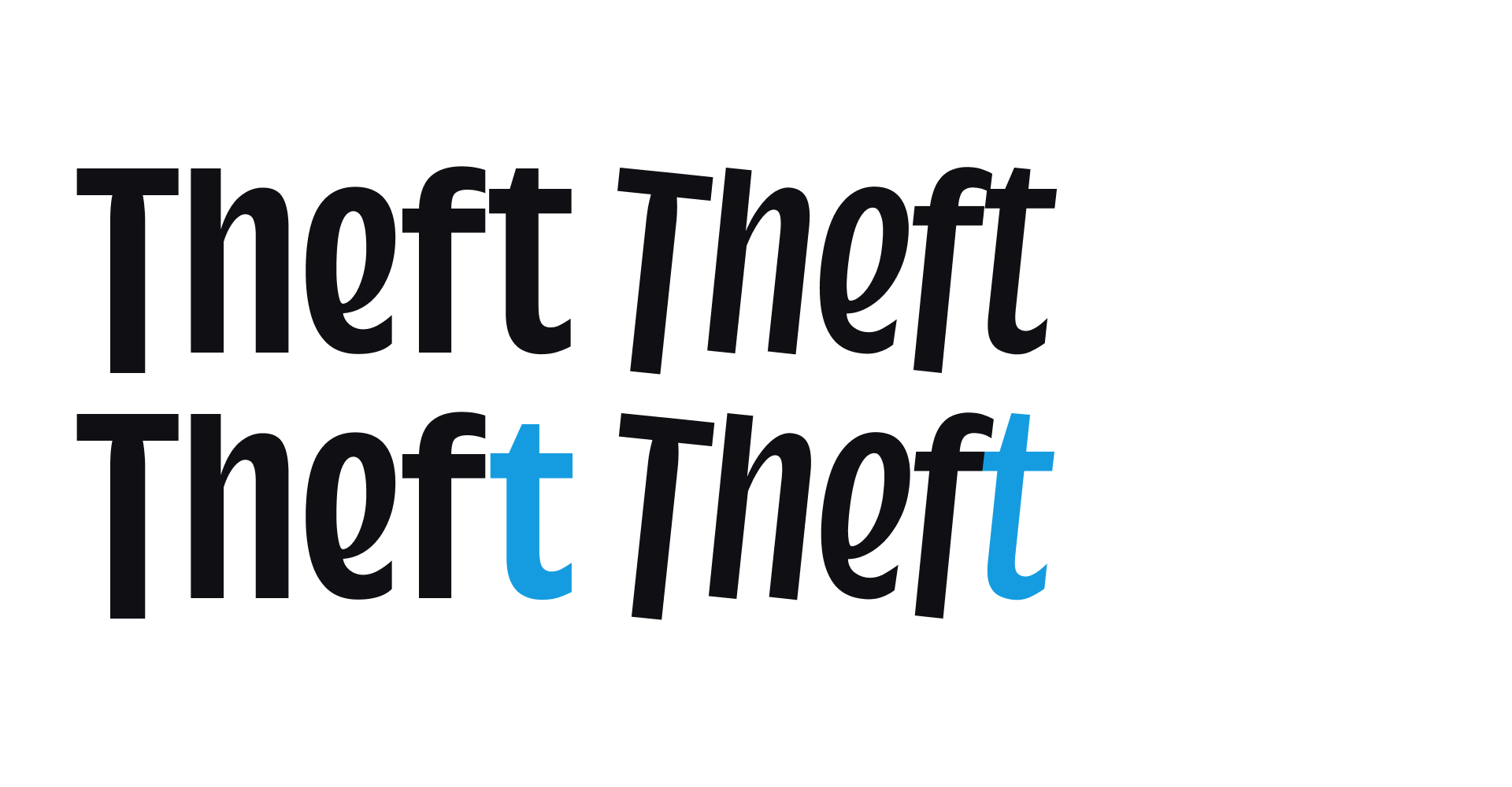
Activate the SS04 feature to swap the t for an alternate shape in both Upright and Italics.
.class{font-feature-settings: "ss04" 1;}

Activate the SS05 feature to swap the f for an alternate shape in both Upright and Italics.
.class{font-feature-settings: "ss05" 1;}
Activate the SS06 feature to lower the t bar, so it lines up with the f in bolder weights, in both Upright and Italics.
.class{font-feature-settings: "ss06" 1;}

Activate the SS07 feature to swap the g for an alternate shape in both Upright and Italics.
.class{font-feature-settings: "ss07" 1;}
| Release History | 11.2025 | V1.000 |
| Format | OT-TTF, OT-CFF, WOFF, WOFF-2 |
| Variable | On request |
| Hinting | Autohint |
| File Size | 50-80 KB |