Fig.1
BM Lithe, once called Aerograf, is a project that started as my graduation typeface during my year at Typemedia, in the Hague. The task consisted in developing our own typeface, from scratch, a project both exciting and intimidating. My initial approach was to sketch as much as possible, to make sure I explored as many ideas as possible. But in this article, I will only talk about the one that led to BM LIthe. There will hopefully be many new projects in the future exploring the other concepts, but if you’re interested in reading more about what I did for my final project, you can find some examples on our graduation website by clicking here.
One idea I kept coming back to was that of a simple but impactful sans. Having previously worked as a letterpress printer at p98a, I had handled a lot of Bethold’s Block and Akzidenz Grotesk, which had really caught my eye. I love the straight-forwardness of these typefaces and my first sketches were strongly influenced by them.
Another influence on my sketches was the Weiß Antiqua, which I had worked on during my revival class in the first semester of Typemedia. What I like particularly about this typeface are the beautifully swashy italics E.R.Weiß had drawn for his italics. Amongst all the ideas I tried out for my final project, I kept revisiting sketches that were trying to capture a sober yet playful sans, with unexpected swashy capitals.
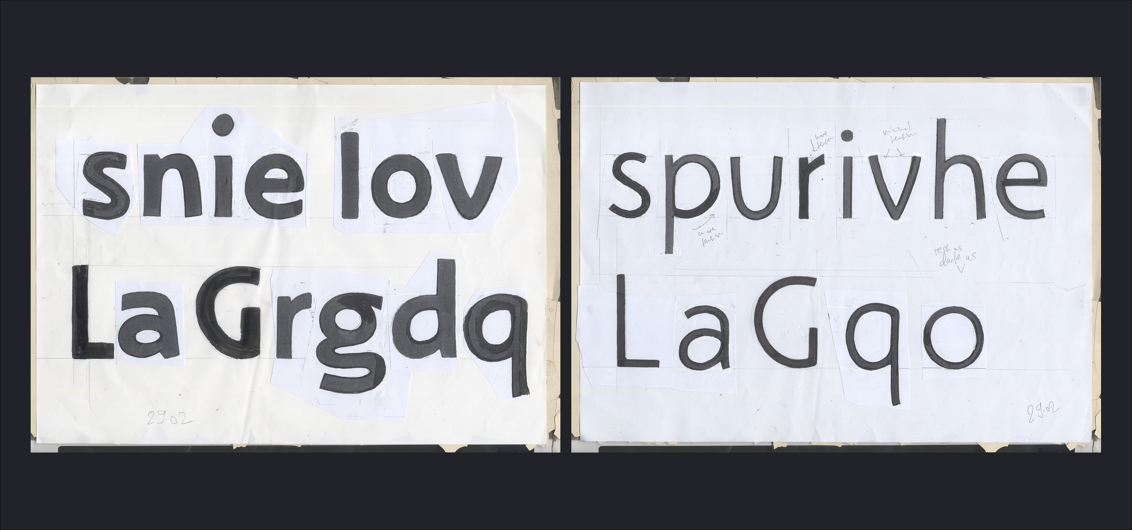
As the distance to the deadline kept shrinking, I saw myself forced to stop sketching and commit to one idea. For one of our end-of-month presentations, I decided to pick one idea and develop it. The first drafts in the image below show a very early version of what would become Aerograf.
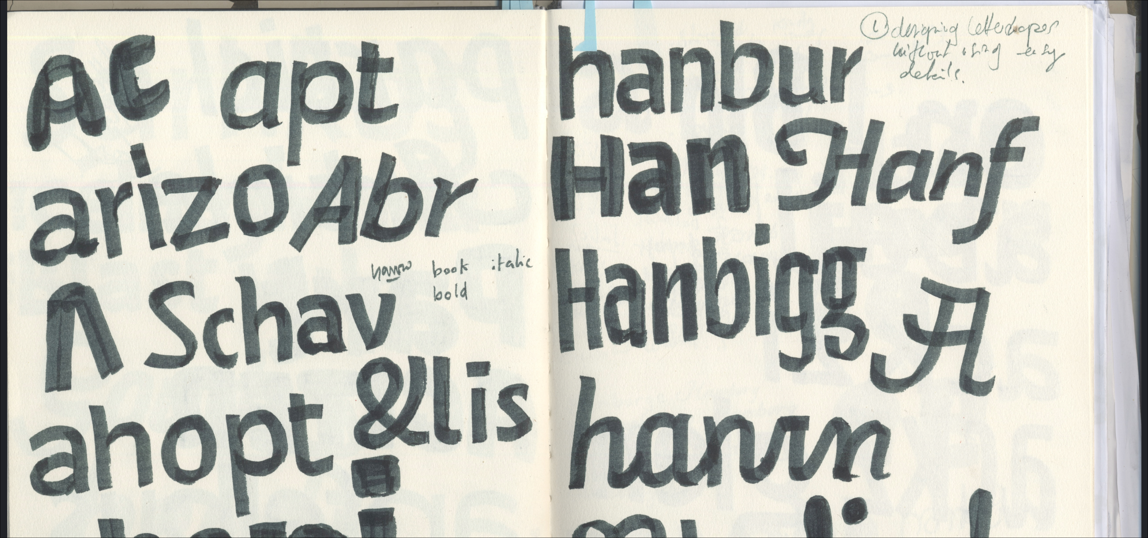
After further feedback sessions, it became clear to me that I was trying to pack too many ideas into one typeface and I decided to tone it down to something a lot more simple. This is when Aerograf reached its final stage and really took shape.
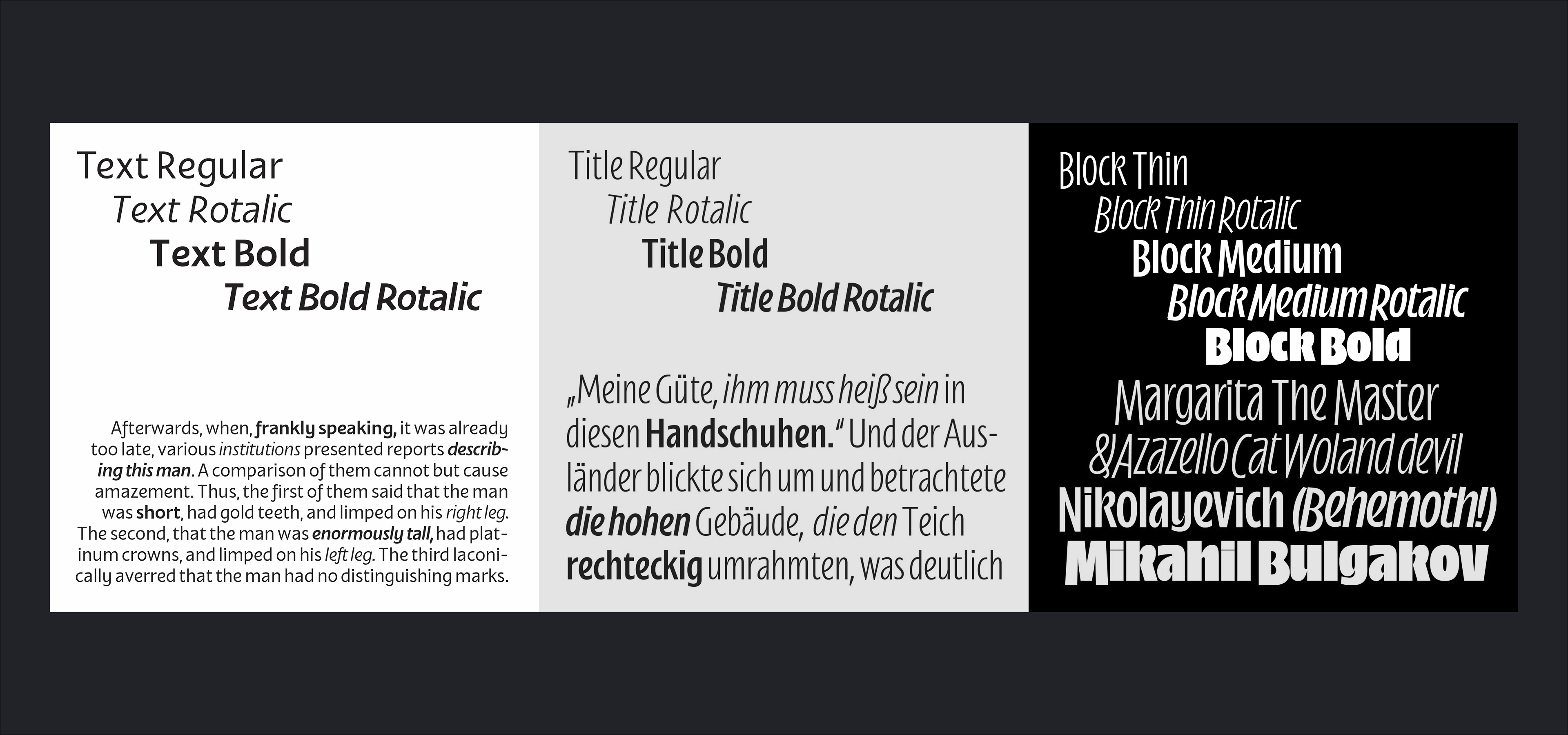
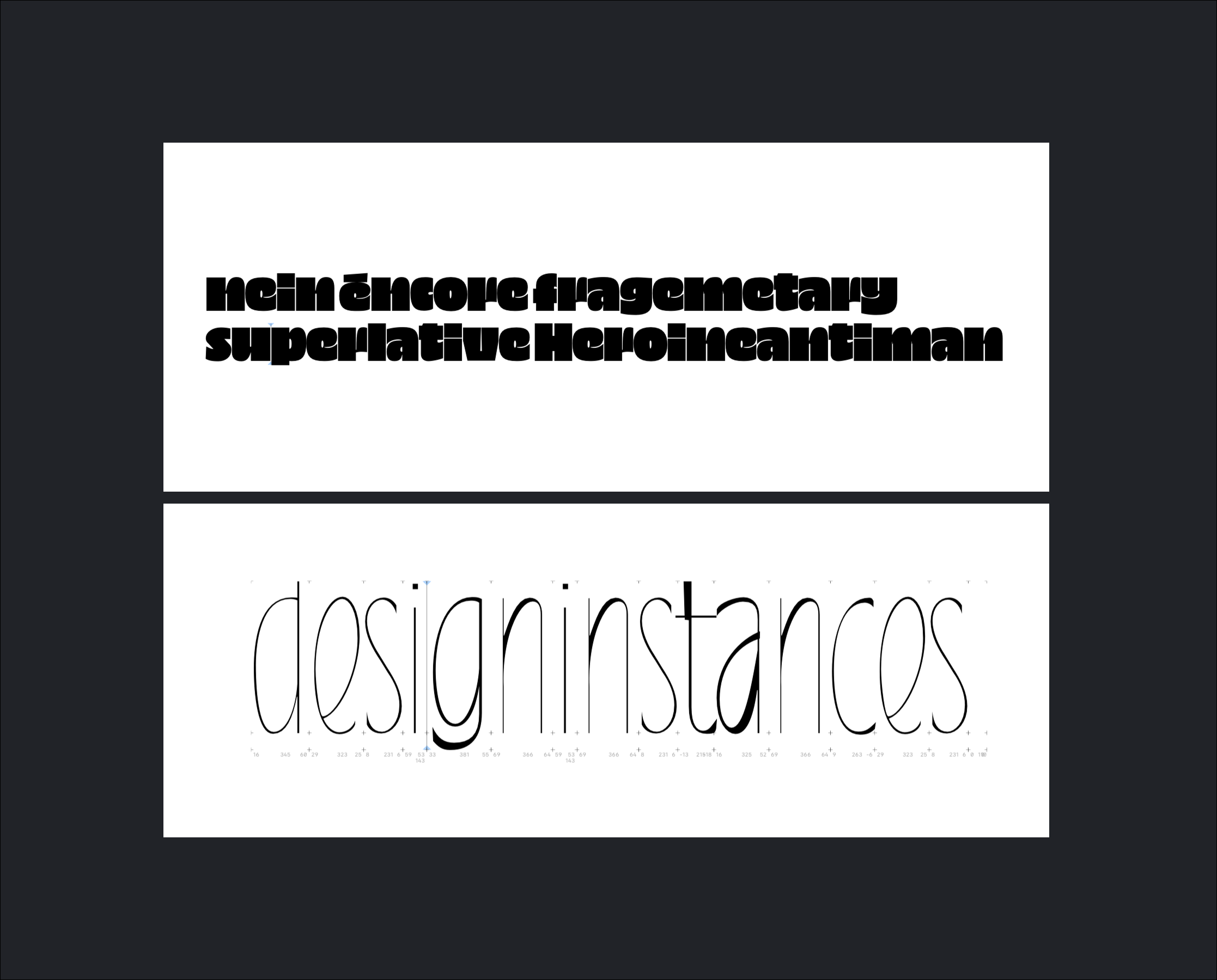
My task then became to think more about the design of the family itself than the letter shapes. I wanted to create a large family that spread the core design over a "text" group, for reading longer texts, a "titling" group with more slender and high waisted letters, and a "display" group with a huge x-height and capitals that would occupy as much space as possible by descending below the baseline. For each group, I wanted several weights, at least covering regular and bold, complemented by italics. I wasn’t interested in drawing those italics from scratch, Instead, I decided to apply my newly acquired python skills to create a pipeline to automate that process partially, rotating all outlines instead of slanting them, and then refining them by hand. As Typemedia projects tend to be, I was able to create a solid prototype, but far from finished.
Fast forward a few months, after graduating: Ceci and I had been working hard on our first release, BM Bless, and we asked ourselves what the next release could be. The next project that made sense to release was Aerograf, as it was already quite advanced and our thought was that it would be good to have something a bit more conventional in our catalogue next.
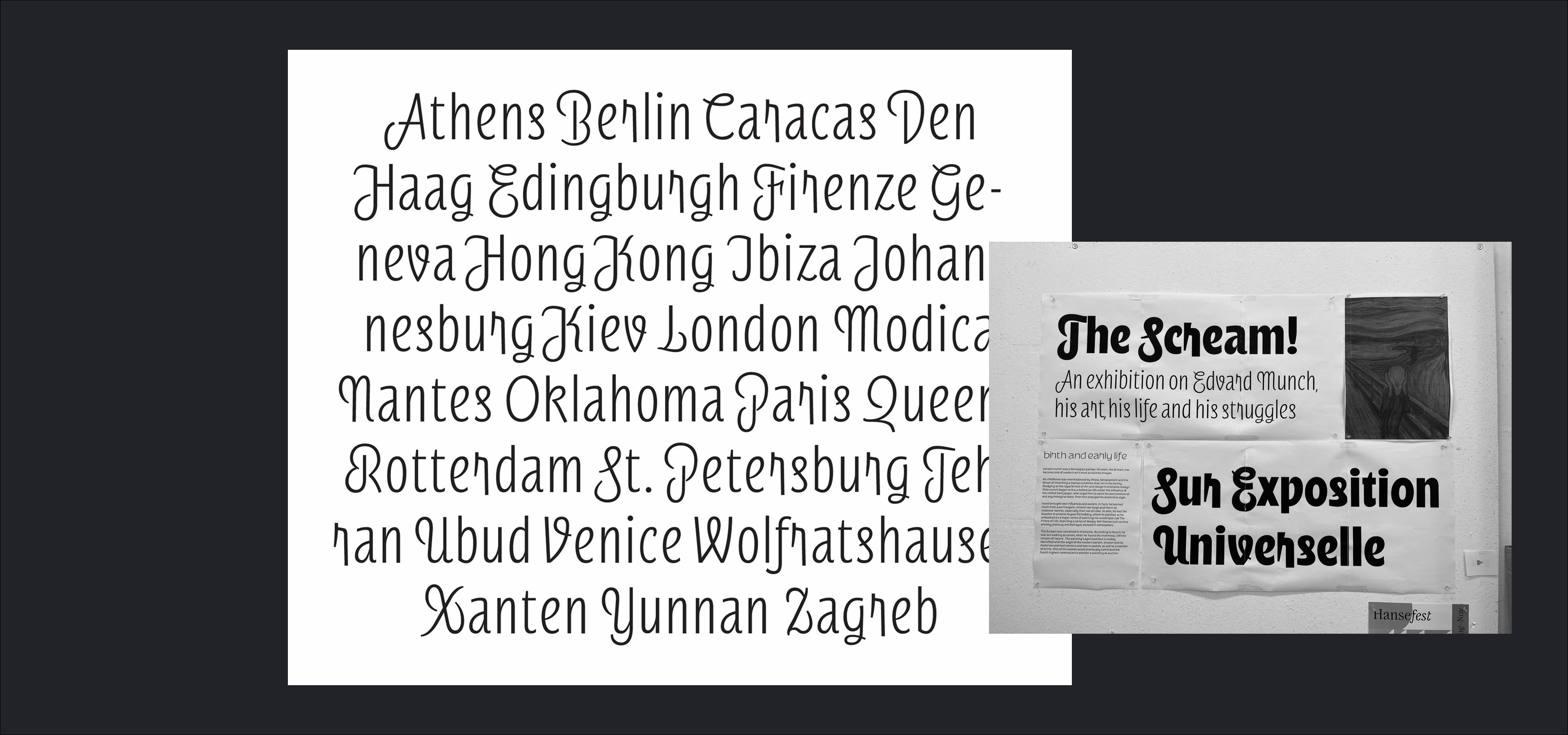
The really interesting part of the Aerograf project was the display style. Since the italics are based on the uprights, the uprights would have to be developed first. Next to extending the glyphset, I also wanted to revisit some of the shapes. With the idea of simplicity still in mind, I changed the existing drawings into crisper shapes. I removed inktraps, which I deemed unnecessary additional information, and added subtle stroke modulations to control the colour of the overall text image.
During my studies, I had drawn smaller alternate lowercase letters to create space to accommodate diacritics, so these could be big and stay within the vertical bounds of the typeface. I got rid of that idea and opted for smaller, simplified diacritics, somewhat more abstract than usual, which is fine for a display typeface.
I also drew all four figure styles, on one hand to have a more complete font, but also because the options are really handy to fit either with the lowercase letters, or the uppercase ones. Another observation I made was that the two extreme sources of the uprights, thin and black, were quite different in width: One major change I made while developing BM Lithe was to broaden the thin, and narrow the black weight.
Whilst producing BM Lithe, I did think about pushing the limits of the designspace and exploring the possibilities beyond the designs I already had. By extrapolating to even more extreme sources, I wanted to see if those would be a nice addition to the project. The ultra thin hairline style, which I started fixing but abandoned, seemed unnecessary. The superblack style, however, is a lot more interesting and is something I could imagine exploring in the future. For the sake of finishing this project in time, I did finally chose to work within the bounds of what I had already designed.
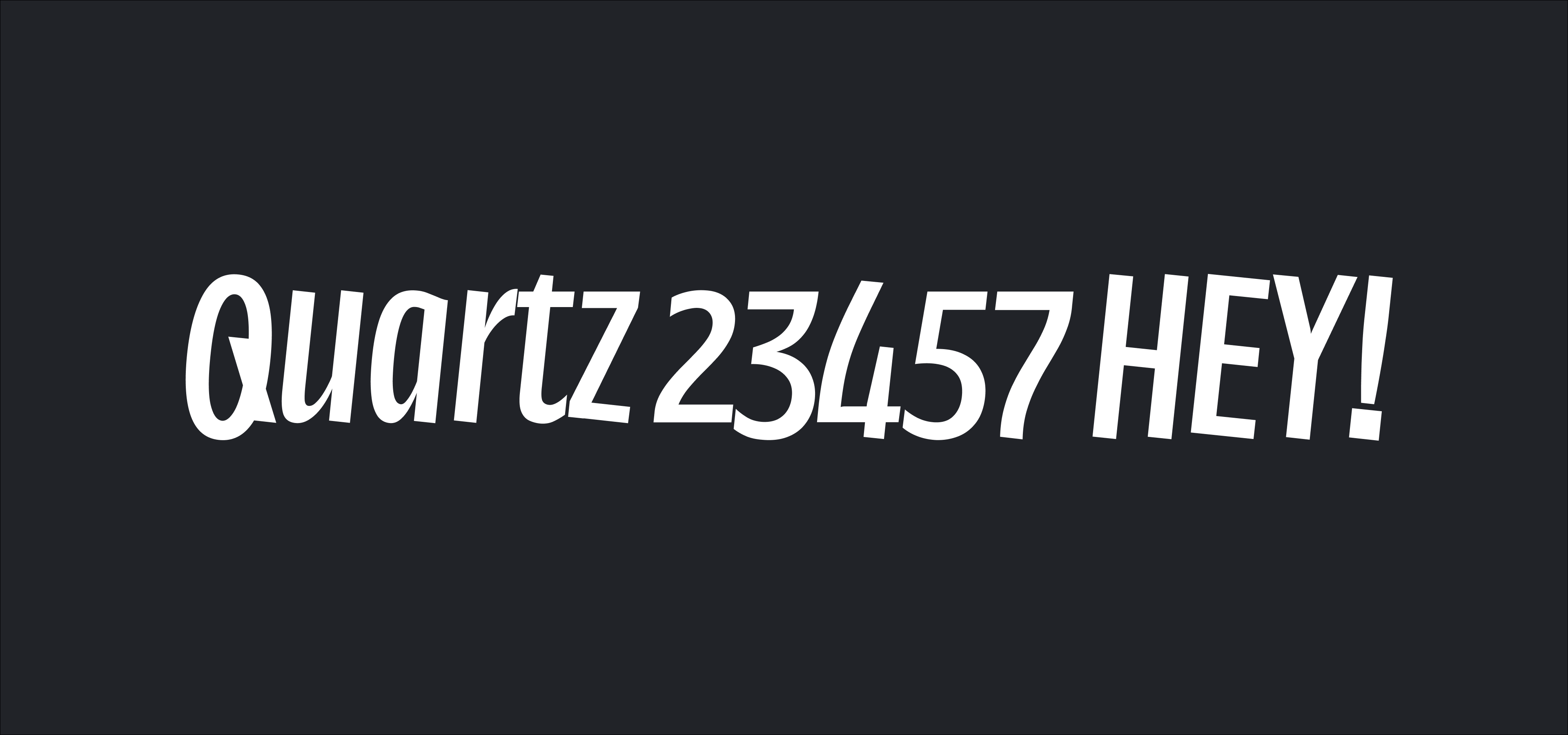
To make the italics (which could technically be called Rotalics, but I preferred to stick to the more conventional form), a small python pipeline was built to execute the following transformations:
- First, copy all upright masters and slightly reduce the weight of each source, as diagonal shapes tend to look larger than their vertical counterpart.
- Then, slightly compress them.
- Lastly, rotate all outlines by 6 degrees.
After that, the task was to adjust everything manually. One drawing decision I made was to make the proportions and the rhythm of the italics a lot more regular. Since italics are a lot more dynamic by nature, doing this helps bring harmony into the overall text image. Another decision I took was to straighten any stroke that would run horizontally, either along the baseline of the x-height (except the z, which had to keep some funk), but only for the lowercase letters. I like that it breaks with the idea of what a rotalic normally is and I think it helps further stabilize the overall text image.
To complete this project, I decided to add some stylistic alternates to enrich the design of this typeface. My favourite ones, like the descending k or lowered t, accentuated the style of this typeface and the interplay of descending caps and lowercase letters. The case feature is a nice addition to help all-caps type settings: it shifts down the comma, period and underscore, to make sure they don't float around the ankles of the uppercase letters.
BM Lithe is a perfect typeface for loud and confident communication. The descending caps take the focus away from the baseline, shifting the visual center of the letters and giving them a light & floaty appearance. In the future, we might look into extending the range of weights and widths to broaden its potential application. Thanks for reading and do get in touch if you have feedback or questions!