Making typefaces is such a clean, perfectionist endeavour. Which of course makes sense: a good typeface makes itself usable by blending into a medium, conveying information without drawing attention to its actual features. In other words, the typeface shouldn’t really be seen. This, of course, requires the designer to reduce the letter shapes down to their most essential silhouette and more importantly, making sure the letters work with each other, in any possible combination. To make sure that aspect works, it is essential to ensure the letters echo specific shape attributes throughout the typeface.
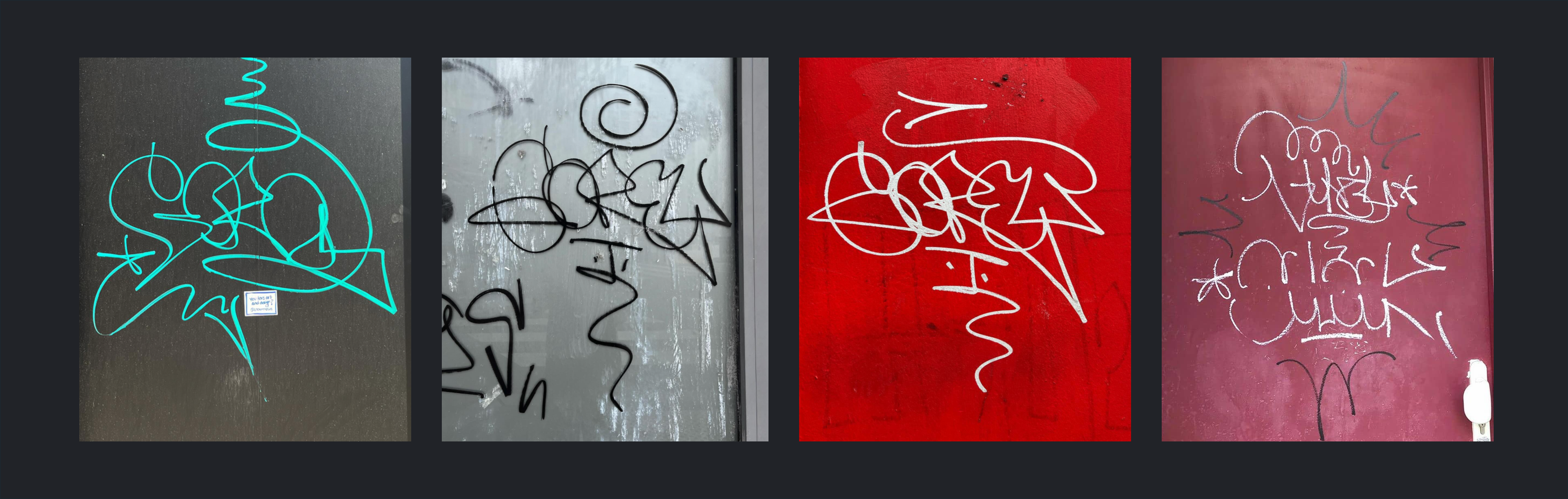
By now, to those who have been following my work, it must be clear that graffiti is a continuous inspiration to my work. The gap between making digital fonts and painting on a wall couldn’t be bigger. In my work as a type designer, I’ve been trying to introduce elements of graffiti which I find exciting into the rigid structure of a digital font: The dynamicness of BM Lithe, the colours of BM Neon, the general "decorativeness" of BM Bless.
An attribute of graffiti, and more specifically of tagging, that has always excited me, is its attachedness. When graffiti artist tag, so “sign” their name on a wall, it often happens that the word is written in a continuous line. Why? Time. Like a normal signature, which is often one continuous line, a tag is written most quickly if the writing tool doesn’t have to be lifted off the surface, saving valuable seconds.
This has led me to this project. The concept of BM Glue has been on my mind for a long time. Looking at writing in general, I have wondered if it might be possible to get more fluidity into a world of script fonts that, because of their construction, often looked quite stiff (except for some exceptions).
I love looking at the handwriting of people. It is very often an expression of their character or at least, tells us something about the writer. So with BM Glue, I set out to find a way to rethink the script font. One issue with script fonts, if drawn traditionally, is how quickly the amount of glyphs & variants become overwhelming.
As with my previous projects, I have tried to leverage the advantages of my job as a font engineer and python programmer to build a font that solves the issue in a slightly more steamroller-kind-of-way: creating all the alternate glyphs that might be needed. This, like my other projects, leads to the issue of file size. I will write about this in the next sections.
The intricacy of script fonts can be seen clearly in some current typefaces. The impressive work of Ulrike Rausch, aka LiebeFonts, shows us what it takes to build a good script font: Opentype features, lots of alternates and even textures or colours to further enhance the handwritten character of the characters.
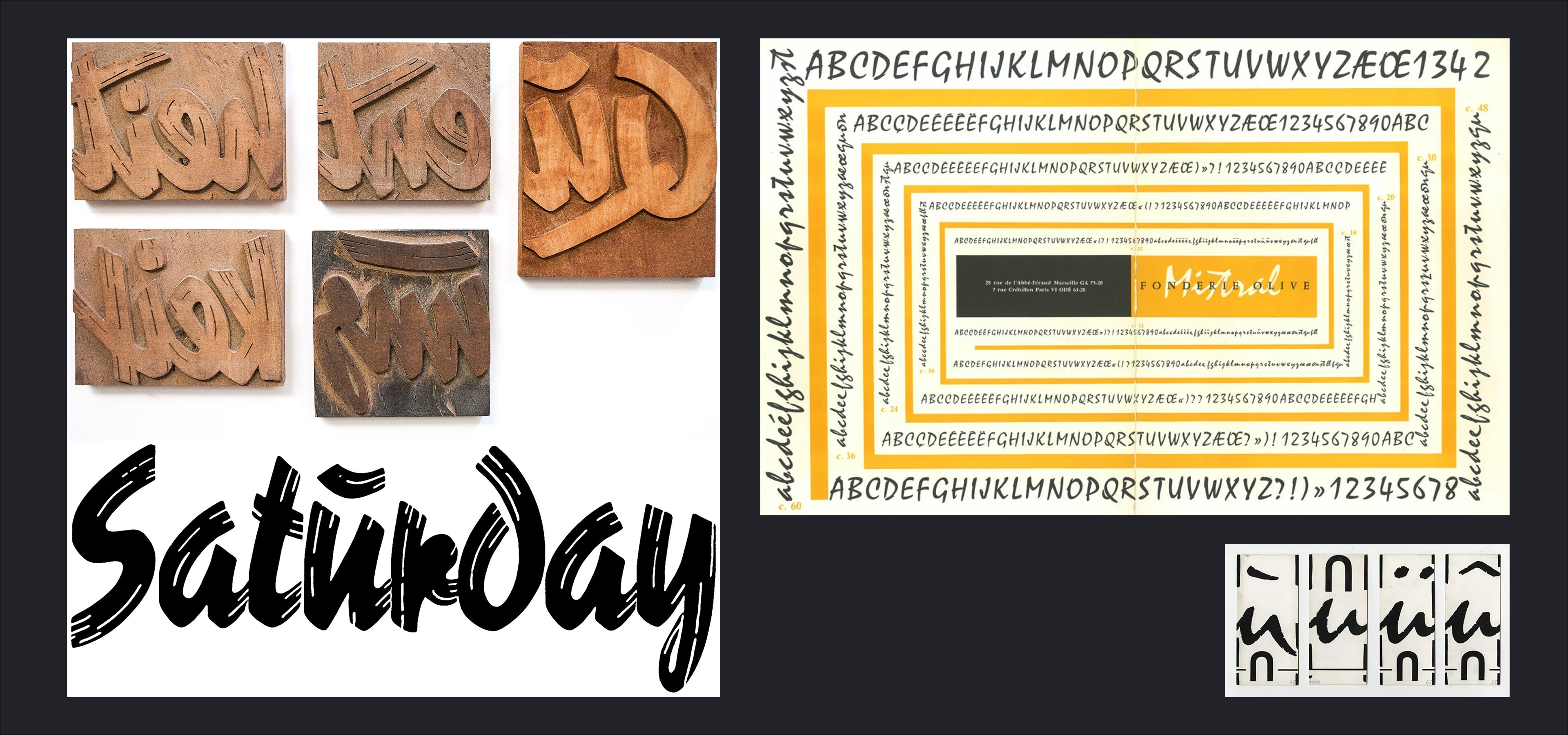
During my work as a letterpress printer, I also discovered the complex type system of a script font called Reporter. In essence, this font tries to achieve the same goals as BM Glue (and script fonts in general). To look organic and handwritten. It does this with a texture that gives the letters a brush written appearance. What I found most surprising about this font was the extensive set of alternates: especially frequent ligatures in German, like “keit” or “ent”, were available as one block. Of course, many alternates to single letters, and a large set of underlines of different sizes were also available. The font spanned over multiple drawers and is something I kept thinking of during the process of BM Glue. It helped my justify the unacceptably large file sizes of my own font!
We can’t talk about script fonts without mentioning Mistral by Excoffon. It is an absolutely ubiquitous part of the french visal culture, and is a script font, not like the previous example, that impresses by its simplicity. Instead of using a ton of alternates, the letters are in fact drawn in such a way that the feeling of organicness appears constant despite the use of the same letters.
Together with Zhenya Spizhovy, we have also been working on another script project looking at the writing of Cresci, as a source of inspiration for our own designs. Here again, the recorded material of his writing, and the multitude of ligatures thought up by the writer shows us how intricate this form of text can become.
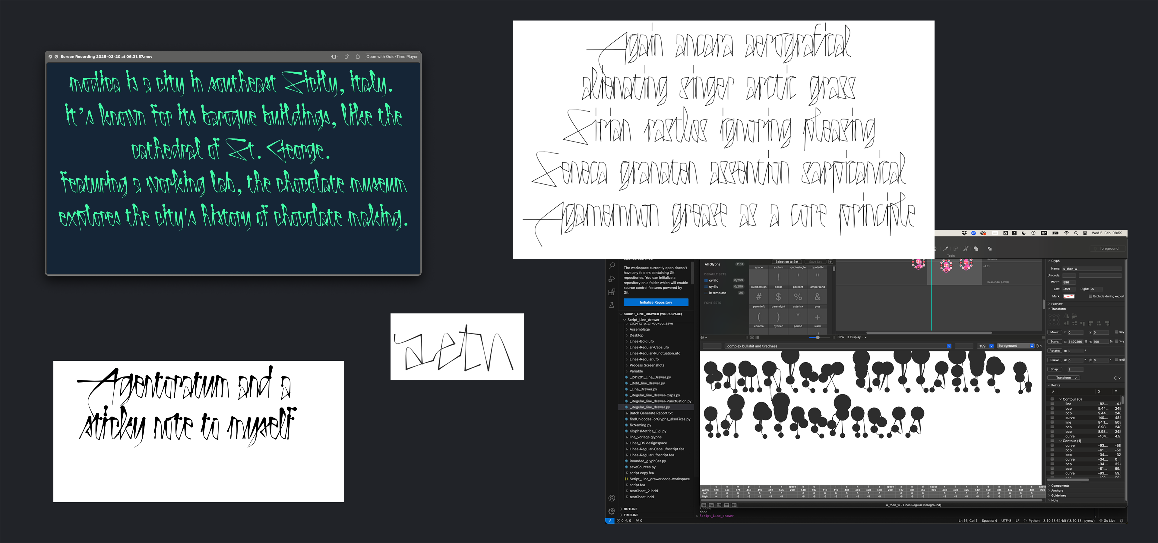
So let's talk a little bit about the process. As mentioned, BM Glue has been built with the help of a fairly complex pipeline which I started working on after graduating from Typemedia. Over time, I was able to extend it and refine it to what it is today. I made a lot of improvements, like reducing the production time drastically, and restarted the core design of the letters about 3-4 four times. The letters are drawn as a skeleton and are inspired by my handwriting.
The pipeline producing BM Glue works in the following way:
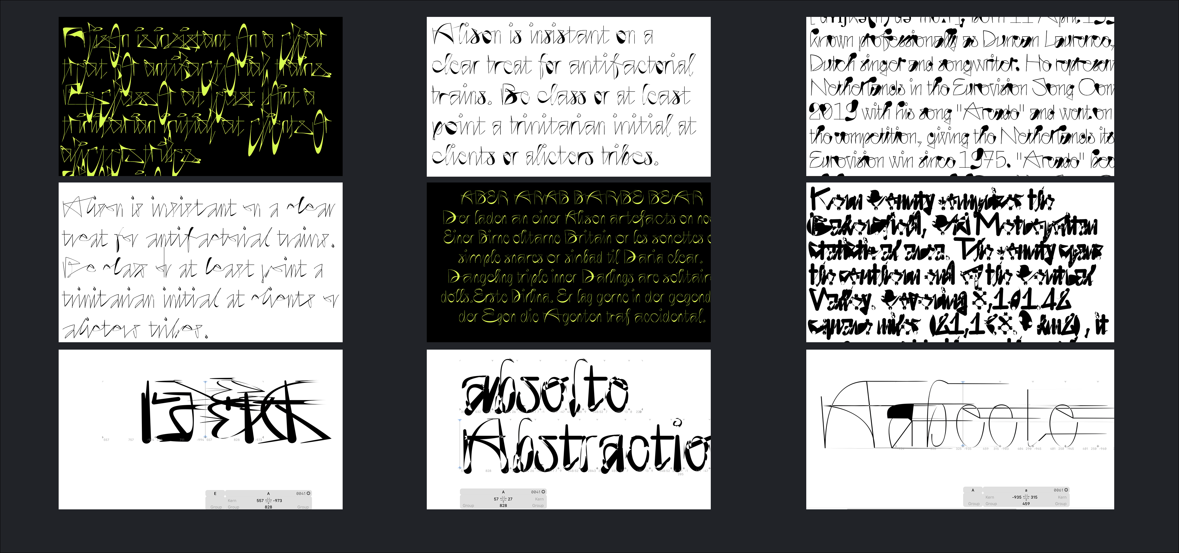
Take the existing skeleton and make many duplicates; take these duplicates and mess with them: take a point at random and reposition it, or stretch the letter both vertically and horizontally: Then, please take the letters and attach them to each other; then write my LIGA feature: then draw the outlines: Then do some post-processing on the outlines once they are drawn.
For the rest of this article, I will look into some of the steps I took and talk about them. I’ll also take the opportunity to show some of the unexpected results produced by the pipeline along the way.
I have realised that some people get very excited when randomness and code is mentioned. I am one of these people. I’ve always wondered why this is. A long term explanation has been that it is a step closer to reality and to life: when we introduce randomness, things become more real. I still think this is true to some extent and is obviously relevant for a script font more than any other style. I also think that randomness excites people that have an artistic vein. Randomness is the substance of art, where interesting things happen by accident. Anyway, back to the project.
I used randomness to really give the letters a fast and scribbly appearance. This works really well. All I needed to do was change the rhythm of the typeface, by alternating the width of each glyph and also the x-height, by making some letters slightly bounce over it.
I also wrote a list of selected points in each letter that are likely to be exaggerated when written. Take the lowest point of a v: in my writing, depending on the mood of the day, this point can go really low. I wanted to add these quirky details to each letter.
Before things get randomized, the glyphs actually get duplicated. So for the lowercase letters, there are 26x26 versions of each letter. At the start of the project, I also had uppercase xuppercase duplicates. I thought it would be an interesting challenge to see if these could also be connected, to really push the connectedness of the project to the limit. But the structure of uppercase letters, which don’t come from the written hand but are constructed shapes, proved that this idea was too tricky to execute. I think it is a challenge that can be mastered, but the file size also became an issue: having UC to UC variants felt like blowing up the file size, which was already large, beyond anything reasonable
I decided to treat the caps differently. Instead of attaching them to each other, I would duplicate them 5 times each, and give them different widths. Why? After looking at my handwriting in ALLCAPS, I realised that the modulation was mainly one of width. To get this aspect into the font, I wrote 5 stylistic sets that allow the users to create interesting variations throughout all uppercase letters.
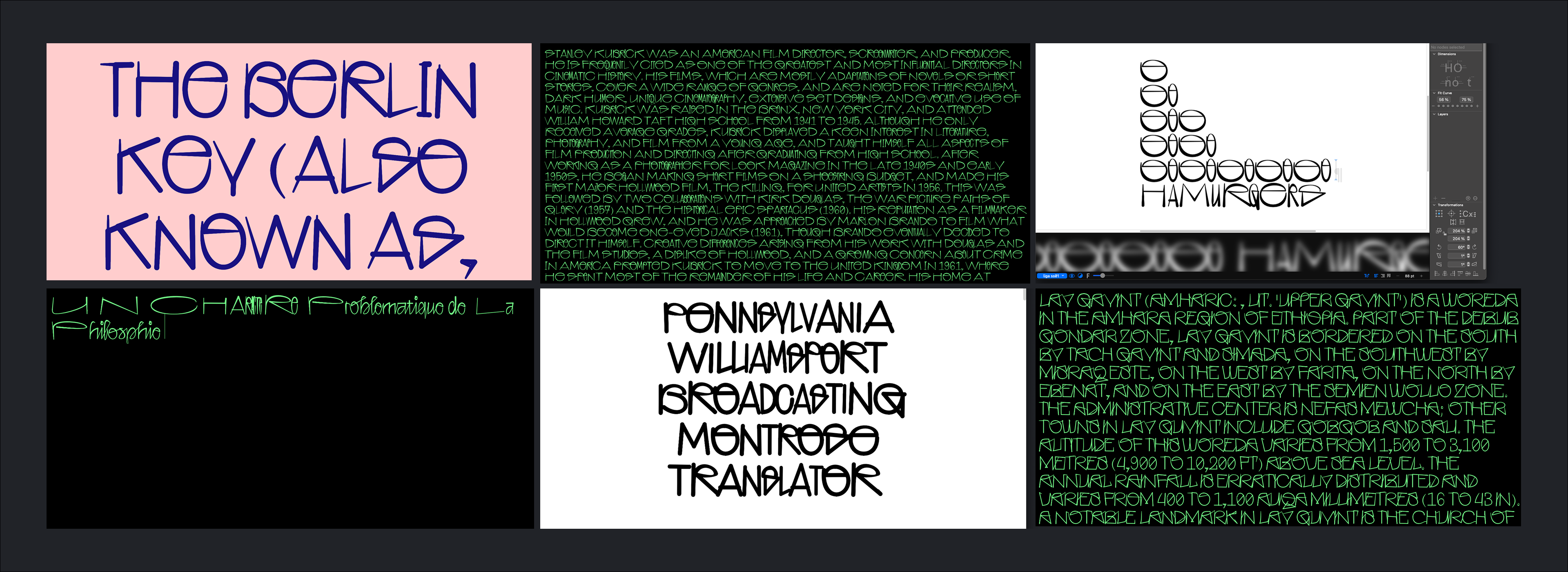
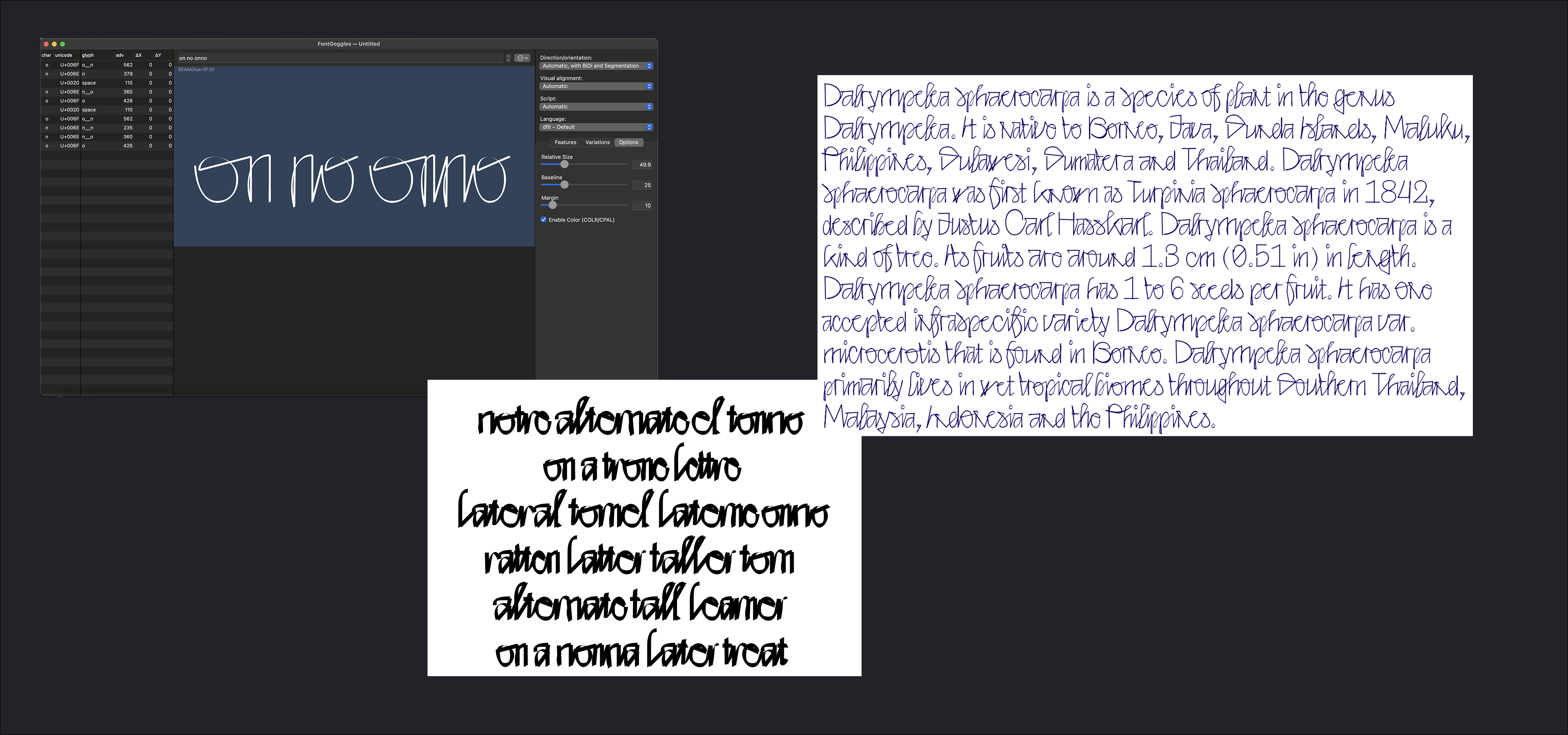
To bring this project together, I decided to use a small glyphset and chose Windows 1252. The question of dealing with diacritics came up. Would these also be connected, thus increasing the size of connectors drastically, or not? To not exaggerate the file size even more, I decided to treat the diacritics like non collected glyphs. I was worried that this would stand out in the text image, but the letters integrate very snuggly with the rest of the attached letters. For the first release, this is how this problem will be solved. For future updates, the issues could of course also be approached differently, integrating the letters with the rest of the connected ones.
The pipeline did a lot of work on the outlines. One part of the process that I automised, was the tapering of the connection part between each letter. With a constant stroke width, things looked a bit slow. A few other adjustments are made: the stroke weight gets slightly reduced for very narrow letter forms in the black weight to help push back against the blobbiness that occurs through that.
I tried drawing the outlines in such a way that also curved ones would look nice and harmonious. After talking with Georg Seifert about his own algorithms used in Glyphs, I had some new ideas and tried to implement them, but didn’t get the results I wanted. I therefore decided to separate the process into two parts. First draw the outlines in a rough way, then post-process them.
I managed to write a fairly satisfactory post-processing script, and had a lot of funny results throughout. The post processing doesn’t produce perfect outlines, but I’ve come to like how they look: the slightly irregular appearance adds to the dynamicness of BM Glue.
Yes yes. I’ve mentioned it and it has been an issue. Well at this stage, it was more important for me to find out if the project actually works instead of worrying about the file size (even if that is ultimately part of the functionality of the typeface). I am very pleased about the visual results and I think the file size issue could be solved in different way. After all, there are scripts in the world that deal with the same issue.
One could simply use some of the static fonts available, and if the variable functionalities are needed, the fonts can be served with lesser axes for example. The font is also available in web formats to further reduce the file size.
BM Glue has been a proof of concept that confirmed to me two crucial things: fonts can be built mostly procedurally and can still look really organic. It has laso opened to me the possibility of further exploring the interrelated letter shapes and build font systems that can use code in an interesting way .