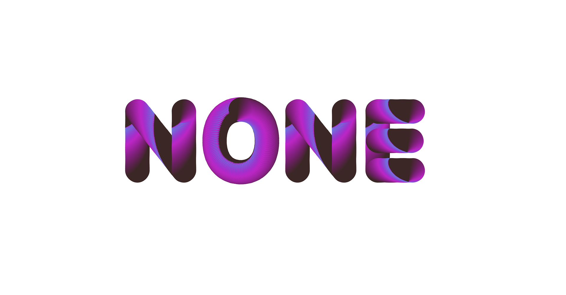
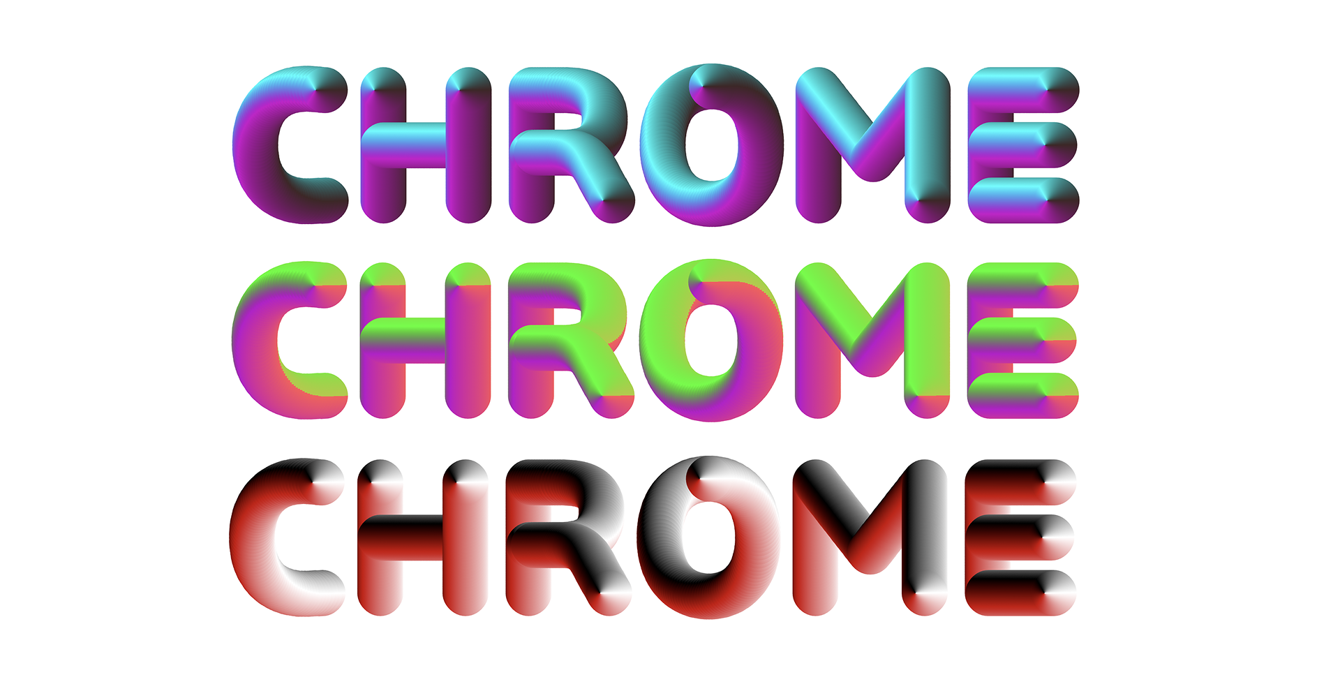
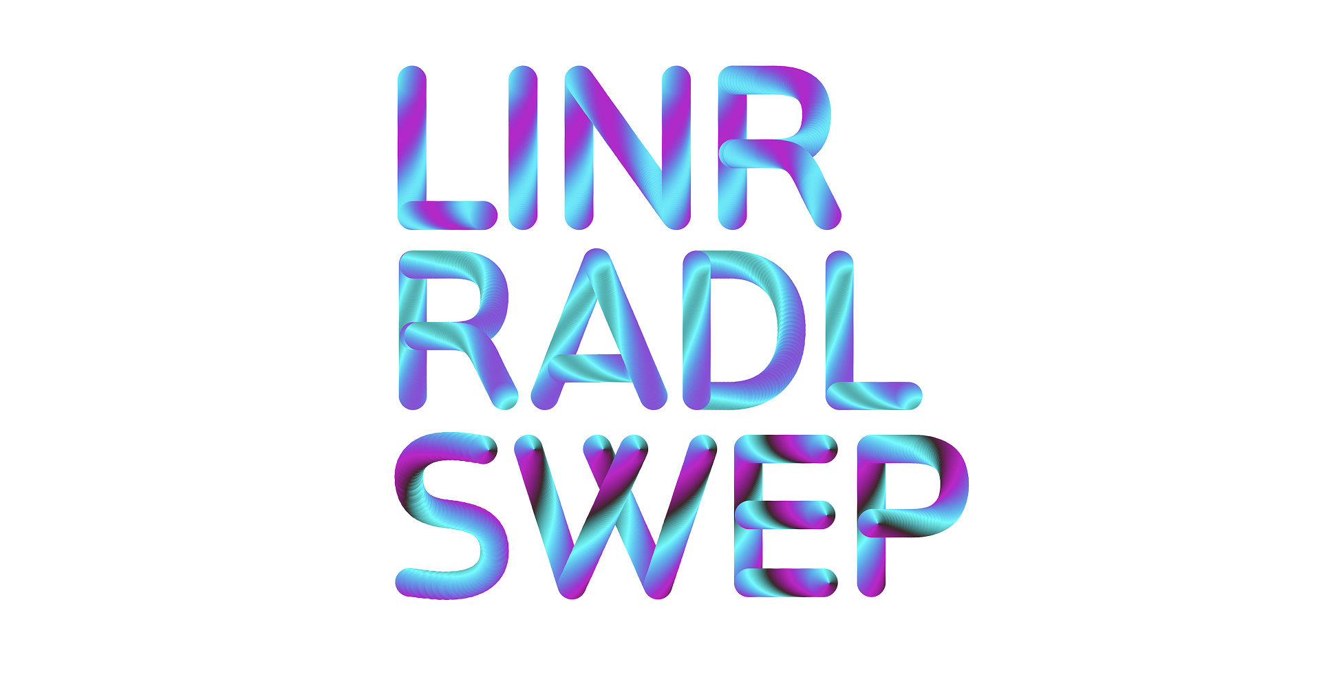
Release History | 05.2025 | V1.000 |
---|---|
Format | WOFF, WOFF-2 |
Variable | Available |
Fallback Outlines | Quadratic (TTF) |
File Size | WOFF-2 ≈ 455KB |
Name | OS/2 Value |
---|---|
Light | 200 |
Regular | 400 |
Medium | 500 |
Bold | 700 |
Black | 900 |
This typeface is available in 5 weights ranging from Light to Black, to let you choose the right amount of emphasis for your text.
.class{font-variation-settings: "wght" 700;}
Name | Col. | Sin. | Noi. |
---|---|---|---|
100 | 100 | 0 | 0 |
010 | 0 | 100 | 0 |
001 | 0 | 0 | 100 |
011 | 0 | 100 | 100 |
110 | 100 | 100 | 0 |
101 | 100 | 0 | 100 |
111 | 100 | 100 | 100 |
BEAM Neon also comes with 3 colour-only axes. Colour allows you to add or remove colour in the most fundamental way. Sine deforms the colour distribution using a simple sine wave oscillation. Finally, noise, just as the name states, adds the colour pattern in a more random manner using perlin noise. You can use each axis separately, but this colour font is most enjoyed when you use the three axes in combination!
.class{
font-variation-settings: "ADDC" 0;
font-variation-settings: "ADDS" 1000;
font-variation-settings: "ADDN" 0;
}
The most valuable thing about colour fonts is that they are highly customisable. Next to the axes, that will let you shape the pattern inside of the letters, you can access the actual palettes for each individual colour making up these patterns. This is done through the @font-palette-values palettes in your CSS code. Copy and paste the snippet below into your website to get started.
@font-palette-values --custom-palette {
font-family: "ColorFont";
base-palette: 0;
override-colors:
0 rgb(63, 38, 38),
1 rgb(0, 255, 255),
2 rgb(204, 0, 204),
3 rgb(200, 100, 155);
}
Each static font, as well as the variable files, contain fallback shapes. These are the black outlines that are used in a traditional digital font. If you see these shapes, and the colour axes aren’t responding on input, this means you are using the font in an environment that doesn’t support COLRv1. These fallback shapes are not intended for regular typographic use.
Activate the SS01 feature to swap your lowercase a and g to a more simple construction.
.class{font-feature-settings: "ss01";}
Activate the SS02 feature to swap your uppercase R to one with a straight leg, placed in front of the main shape.
.class{font-feature-settings: "ss02";}
If you are planning to mostly work with uppercase letters, activating the case feature could be useful. It will center most punctuation according to the optical center of your uppercase letters, not the lowercase letters, which is the standard.
.class{font-feature-settings: "case";}