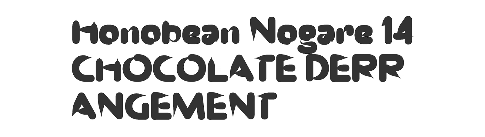
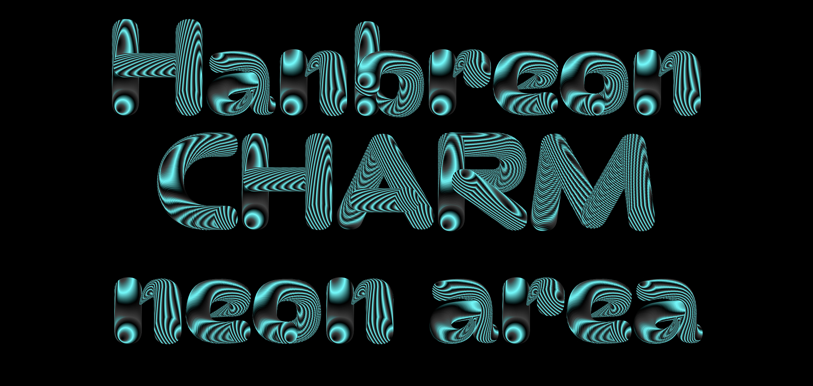
Fig.1
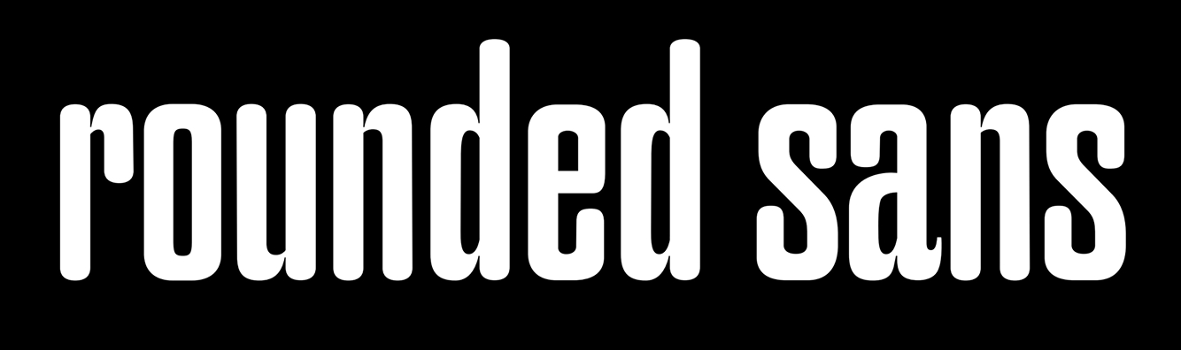
Today is an exciting day for me, because writing about the process of a project usually means it is close to release. And so it is: Neon has definitely reached a level of maturity deserving version number 1.0. This project has particular meaning to me for two reasons: Firstly, because it has proven to me that two areas I am very excited about are combinable to very innovative effect: so-called “creative coding”, also known as generative design (I personally like Vera van der Seyp’s term “computational crafts” most), which is basically experimental coding aimed at creating computer graphics of all sorts, can be indeed be combined with type design. Secondly, seeing how much potential there is in playing the COLR table.
Between now, when I am writing this article, and the moment this idea came about (end of 2024), a lot has happened for Beam Type. Working as a font engineer at Alphabet Type has been a huge boost in my understanding of code and fonts. And at Beam, we’ve designed, built and released the beautiful typeface BM Bless. This was our first venture into the realm of possibilities that this exciting combination allows.
Since 2024 and now, this project has been entirely rebuilt 3 times. Since in terms of design, only single paths need to be traced, a pipeline had to be built to handle everything else, the biggest part being the construction of the COLR table. A big challenge in building such a production pipeline is to make it reusable and understandable for your future self and others. This was, among others, the reasons for the rewritings. Read more about it in chapter 7.
So about a year ago, Cecilia and I were talking about how we could combine coding and more type design, an idea which had started at Typemedia (read more about this in the process page of Bless). One Idea I was carrying around with me for a while was that of placing items along a path. The first time I had seen this working in a font was when I was preparing my portfolio for Typemedia, in the mercilessly cold Berlin winter months of 2023. A classmate from my undergraduate Degree in Communication Design, Paul Sturm, who had just gotten back from learning type design at ECAL, showed me how this could work in font Software, via scripting. To me, this concept was super exciting, because this robotic repetition of shapes has its own, beautiful aesthetic.
During Typemedia, Just van Rossum had shown me how to inject COLR data into a font. This brought me one huge step closer to the aesthetic of “creative coding”: suddenly, the world of colours, gradients and transformations was accessible. If the term “Creative Coding” still means nothing to you, please check the work of people like Sander Sturing, Yehwan Song, K.D. Mutschelknaus, Zach Liebermann or Vera van der Seyp. These are only a few names of a huge community of insanely creative people, who have inspired me over the past 8 years.
Looking at Vera van der Seyp’s work, which is always simple yet very striking, specifically at the work she produced at the MIT Media Lab “Simulating Motion with Computation”, was the last piece of my conceptual puzzle: The incremental rotation of each shape based on its index on the path, combined with a gradient, is just amazing.
I want to make sure the credit is given where it is due: What Neon has become is the result of many pieces of input I was able to collect over the years. It is both its own thing but also an ode to all the sources of inspiration and beautiful things that I’ve come across.
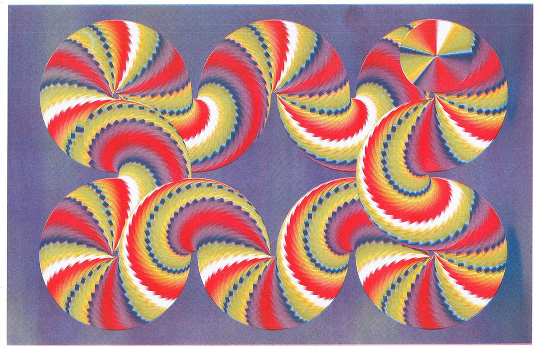
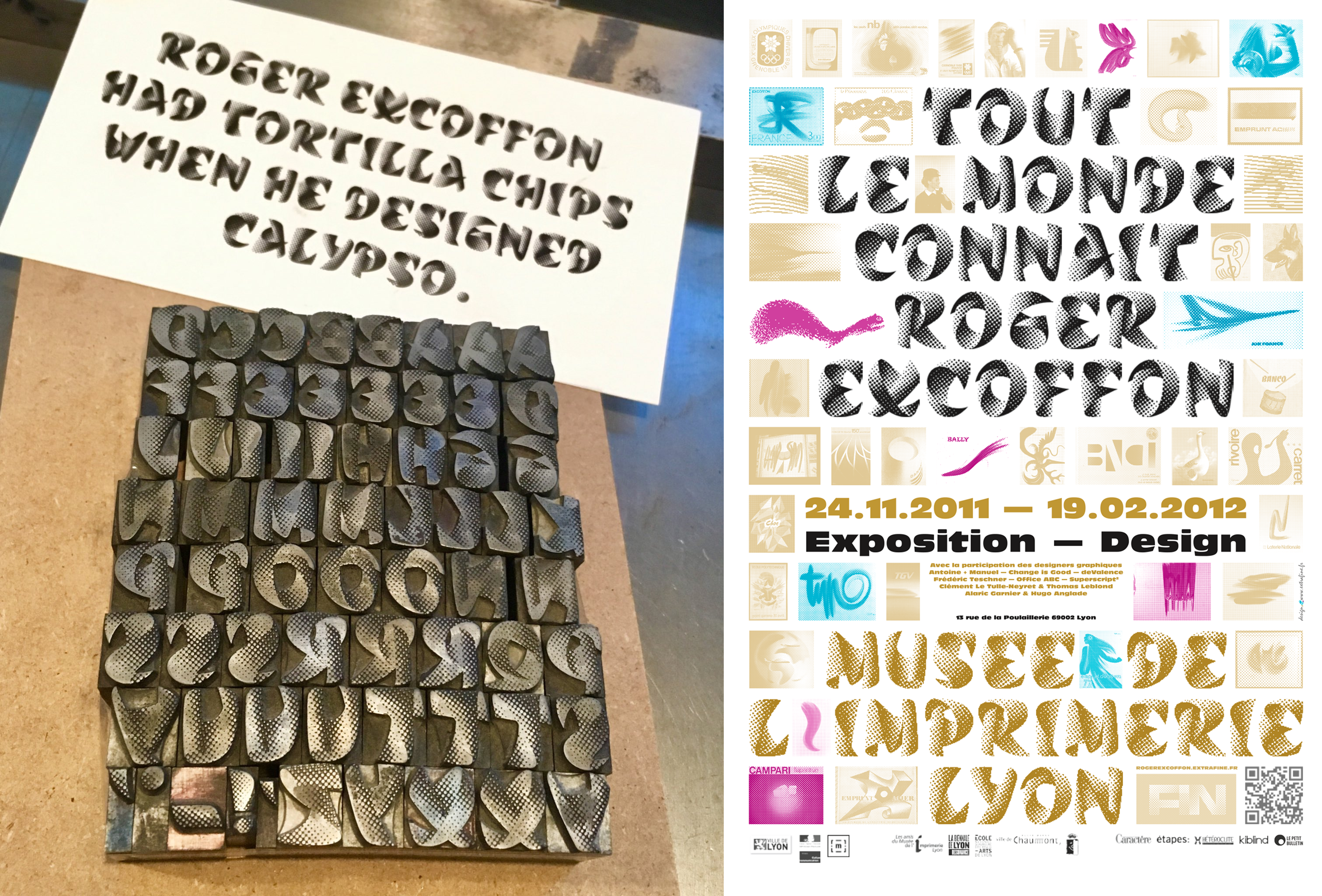
During my year and a half as a letterpress printer at p98a, a formative time that really opened my eyes to the world of fonts, I had access to a plethora of rare and beautiful fonts. One, that really struck me, was Calypso by Roger Excoffon: Calypso is an insane “trompe l’oeil” of a font, pretending to fold in over itself. The effect of depth is created by the smart use of halftones, which is basically the representation of gray scale gradients through a grid of dots of different sizes.
A major lesson from my teacher Erik van Blokland at Typemedia was to consider the materiality of a typeface sketch. This advice has stayed with me since: In fact, there is a whole class of typefaces that try to go beyond the 2D barrier, that of simple black and white shapes, and elevate materiality to the world of tactile realism: letters mimicking bricks or leaves, 3D letters with complex shading and so on. This is very common in lettering and graffiti, and a bit less usual in type design. These typefaces always blow my mind: in the time of punch-cutting, making such a thing must have been so much work. For calypso, each dot was probably calculated by head and drawn by hand - geez!
I think that Neon belongs to this category of typefaces. Thankfully, there is code to assist us in calculations and drawings today. Drawing halftones with Python would be quite easy to do. This doesn’t mean this project wasn’t excruciatingly complex. Let me talk more about what went into it in the next chapter.
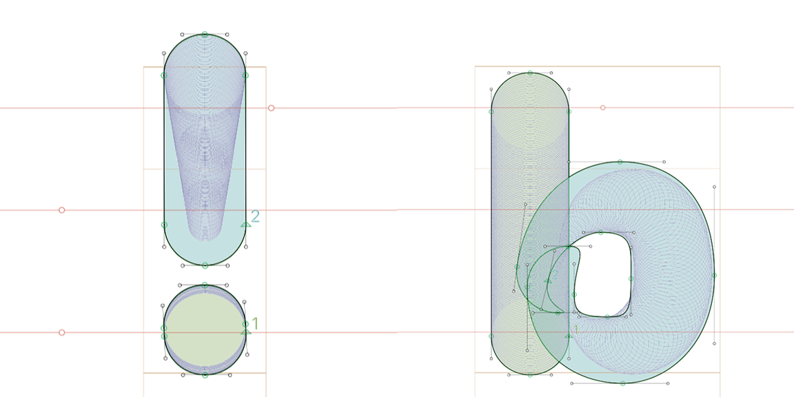
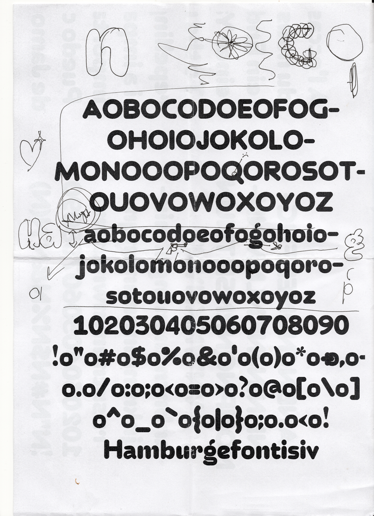
As I mentioned, Neon was made by drawing dozens of ellipses along different paths. As any type designer knows, the one true art of type design, arguably, lies in knowing where to make optical illusions and adjustments: small changes that make the typeface look as it was intended to look in a specific context.
I had two issues with the project: Firstly, the monolinear stroke width of the typeface needed adjustments. Ideally, a small reduction in weight whenever the stroke runs horizontally, as those always appear thicker. Secondly, I needed typering at the points where a stroke would enter the stem of the letter, like in the letter n.
My solution was to add two new functions to the pipeline: one that would adjust the COLR ellipse size by getting the angle of its normal, another one that would allow me to taper the Ellipse size at a given junction point. These were a central attribute of phase 1 and 2 of this project. Doing this started making the pipeline quite cluttered, but I also acknowledge that my scripting abilities were at a different stage then.
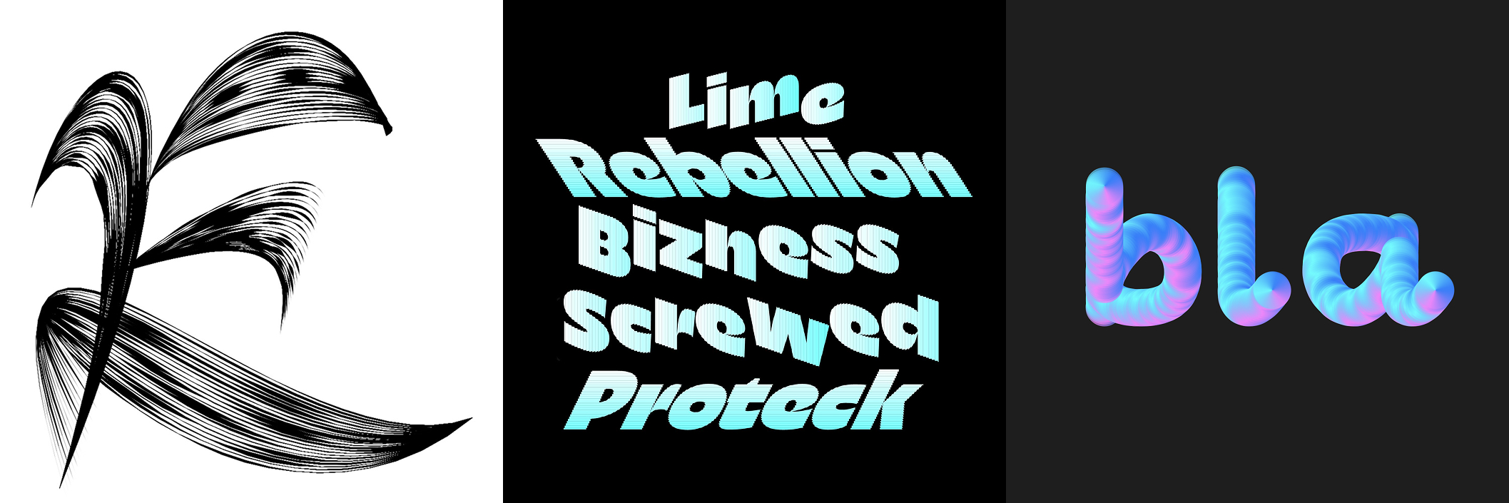
As with many projects, what you see now is just a very refined and compact version of many explorations that were then discarded. One thing we considered doing was to add an oblique version to the project. This would have been quite straightforward to execute, and I made some tests.
Trying out alternatives and new things in a project by stretching the designspace or the design itself, is a very exciting process. With code involved, some of the most unexpected things can happen. Both in the shapes of the letters themselves or in the way the colour data was structured, some very weird things happened.
With experimental projects, there is always this moment where, once you see the core concept working, you come down from a little euphoria moment. And as your stomach sinks, you ask yourself “but will this actually work as a font?”. Many problems start manifesting: will the font work on all software? Will it render properly? Will people understand how to use it? This additional element of complexity with making experimental fonts is that they still have to be usable to at least a fundamental level of expectation.
The reason we decided not to include the oblique or slanted version to the variable font is that the file size is already considerable at this stage. This is problematic in a browser based environment. The COLR table currently takes up a huge amount of space. I’ve been trying to find ways to further compress the data but haven’t found a solution here yet. If you know how, do get in touch!
Another issue with COLRv1, although it is getting better, is the problem of compatibility. The big players in the field of fonts have been fighting on font formats since a while now, mostly only supporting their own formats. This is an issue that has affected the COLRv1 table. Most design software doesn't support it, except for Adobe Illustrator. Weirdly thought, Illustrator cannot handle sweep gradients. Safari just doesn’t handle COLRv1 altogether, This is quite frustrating as a designer: although we are trying to create innovative designs and functionalities, we are limited to the decisions made by those who own the environments in which our fonts render.
We want to release this project either way, to show what is possible with fonts. Hopefully it is an investment into the future. For the moment, before licensing it, it is absolutely critical to know if the area where this font should be used does support COLRv1. We’ve added information about this on the USAGE page.
This would usually be the last chapter, where I write a short conclusion about the project and what the plans for the future are. What happened a few weeks ago though, just as I thought that this project (the v2 of the pipeline build) was done and ready for release, is that I showed a proof of the typeface to a fellow type designer and Typemedia Alumni, Benn Zorn, whose opinion I appreciate a lot. After looking at the black and white shapes for a while, he said that all the corrections, especially the tapering at connection points didn’t fit the typeface. It took me a moment to accept the feedback but then I realised he was right: overall the typeface did have a sort of robotic CNC-milling-type-vibe, and the more organic parts fell out of this concept. All the smart things I thought I invented were useless.
At this point, the version 2 of the pipeline was an absolute uneditable mess. This meant that I had to rewrite everything. With the approaching deadline for the project, this meant a lot to do in little time. But doing this was an extremely helpful development of the project. I restructured the scripts, and redrew the skeleton, allowing me to build a version that was much flexible: this means it can be changed, developed and improved at a further point in time. Thanks Benn!
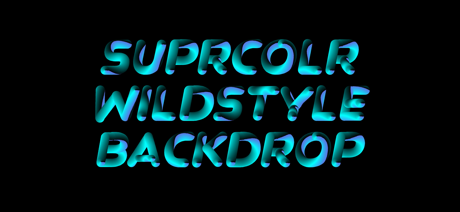
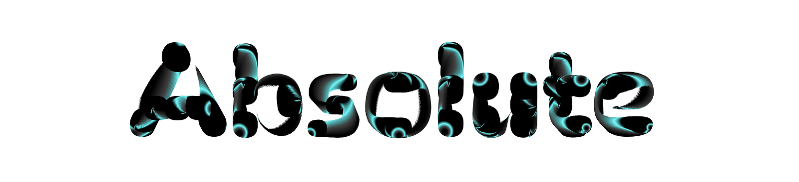
BM Neon currently covers the 3 available gradients, Linear, Radial and Sweep. Each variable font has a weight axis plus 3 additional ones with which the colour patterns can be controlled. Exploring those patterns is definitely an area of endless discoveries. I definitely think that the filesize issue must be tended to. Surely there must be a way to compress the data to make these files a little more light! The last big thing of the future is compatibility. I do hope that sooner rather than later, all design software companies and browsers with a sight towards the future will make a font like Neon work!
If you have any feedback, suggestions, wishes or ideas for BM Neon, please send them our way at info@beamtype.com